The Best Free Platforms for Creating YouTube Channel Banners Fast (With Templates and Free Images)
Introduction
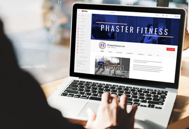
Your YouTube channel banner is the first thing a visitor sees when they land on your page, and it tells them everything they need to know about your brand in a split second. For many creators, though, the design process feels like a barrier rather than a creative opportunity. The good news is that today’s online platforms make it possible to design a polished, professional-looking banner in minutes, without any graphic design experience. This guide walks you through how to find and use the best free platforms that combine customizable templates, free image libraries, and one-click editing tools to get your channel looking its best.
Why Your YouTube Channel Banner Actually Matters
Before diving into platforms and tips, it is worth understanding why your channel art deserves real attention. YouTube displays your channel banner across desktops, tablets, and mobile devices, which means the image needs to scale well and communicate clearly at multiple sizes. A blurry, generic, or off-brand banner signals to potential subscribers that your channel is not fully committed, and that first impression can cost you a follow.
Beyond aesthetics, your banner is a branding touchpoint. It is where you can reinforce your posting schedule, your channel’s tone, and your niche identity all at once. Channels that invest even a small amount of time into a clean, consistent banner design tend to see stronger click-through rates on their profile and better subscriber retention over time.
The ideal YouTube banner dimensions are 2560 x 1440 pixels, with a “safe zone” of 1546 x 423 pixels that displays across all devices. Any platform you use should either provide this template by default or allow you to set these dimensions manually.
What to Look for in a Free YouTube Banner Creation Platform
Not every free design tool is created equal. When you are evaluating platforms for making a YouTube banner, here are the most important features to look for:
- Pre-sized YouTube templates: Look for platforms that already have templates built to exact YouTube banner dimensions so you do not have to guess or manually resize.
- A built-in free image library: Access to stock photos, illustrations, and icons without leaving the platform saves an enormous amount of time.
- Font variety and text controls: Your name or channel title should be legible at any size, so robust typography options are a must.
- Download options without watermarks: Some free tiers watermark your work. Confirm the platform allows clean exports, at least for standard file types.
- Drag-and-drop usability: You should not need to read a tutorial to use it. Intuitive, visual editing is the baseline standard for any good banner tool.
- Layer and element controls: Being able to reorder, resize, and opacity-adjust elements gives you creative flexibility beyond what basic tools offer.
Keeping these features in mind will help you avoid wasting time on platforms that look useful on the surface but fall short when you actually need to produce something.
10 Tips for Creating a Great YouTube Banner Quickly
1. Start With a Template Built for YouTube
The fastest path to a finished banner is starting with a template that is already sized correctly and visually balanced. Look for platforms that categorize their templates by use case. Choosing a “YouTube channel art” or “channel banner” template means the proportions, text placement, and visual hierarchy are already working in your favor. All you need to do is customize the colors, swap in your own fonts, and update the text.
Starting from a blank canvas might feel more creative, but for most creators it leads to wasted time on layout decisions that a professional designer has already solved. Templates are not a shortcut around creativity. They are a starting point that lets you focus your energy on the details that actually differentiate your brand.
2. Use Adobe Express for a Streamlined Banner-Making Experience
One of the most capable free tools for this purpose is Adobe Express, which offers a dedicated workflow specifically for channel art. You can use the YouTube banner maker to access dozens of professionally designed templates, a robust free image and icon library, and intuitive drag-and-drop controls. The platform is built for people who want fast results without a steep learning curve, and it handles the correct dimensions automatically so your banner will look right on every device.
Adobe Express also connects to Adobe’s creative ecosystem, which means access to a wide range of fonts, color palettes, and design assets. Even on the free plan, the output quality is high and you can download your banner without a watermark. For creators who want to revisit and update their banner regularly, the ability to save and re-edit your project is a significant time saver.
3. Match Your Banner to Your Channel’s Color Palette
Consistency between your banner, your thumbnail style, and your profile picture makes your channel feel like a cohesive brand rather than a collection of disconnected videos. Choose one to three primary colors and stick with them across all your visual assets. Many free platforms include color palette tools that let you input a hex code or pick from a preset scheme, making it easy to stay on-brand once you have defined your look.
If you do not yet have an established color palette, start with the colors that feel most representative of your niche. Gaming channels tend to gravitate toward bold, high-contrast palettes. Lifestyle and wellness creators often lean into soft neutrals and warm tones. There is no universal rule, but your palette should feel intentional rather than accidental.
4. Keep Text Minimal and Legible
Your banner should communicate one to three ideas at most: your channel name, a tagline or value proposition, and optionally a posting schedule. Overloading the banner with text makes it harder to read and harder to look at. Choose a font that is bold and clean enough to read at small sizes, since many viewers will see your banner on a tablet or phone screen rather than a full desktop monitor.
When in doubt, larger text wins. A single well-placed channel name in a strong font will outperform a paragraph of smaller text every time. Pair a bold headline font with a lighter body font if you need more than one line of text, and leave breathing room around each element so the design does not feel cramped.
5. Take Advantage of Free Stock Image Libraries
Most modern banner creation platforms include a built-in library of free stock photos, illustrations, and graphics. These assets are typically licensed for commercial use, meaning you can use them in your banner without worrying about copyright. Using platform-native images also means you do not need to download anything from a third-party site, which keeps your workflow faster and simpler.
When selecting background images, look for photos with natural negative space or areas with low visual complexity. Busy background images compete with your text and make banners feel cluttered. A simple gradient, a soft landscape, or a solid textured background often works better than a detailed photograph.
6. Design for the Safe Zone First
Because your YouTube banner displays differently across devices, the “safe zone” (the center 1546 x 423 pixels of your 2560 x 1440 design) is the only area guaranteed to be visible everywhere. Design your most critical elements, especially your channel name and tagline, within this zone. Decorative elements can extend into the outer areas, but do not put anything you need viewers to see outside the safe zone boundaries.
Many templates on reputable platforms mark the safe zone with a visual guide overlay so you can see exactly where to keep your key elements. If the platform you are using does not include this, you can add a temporary rectangle in the correct dimensions and delete it before exporting.
See also: Mutf_In: Hdfc_Tech_Dir_1en8beo
7. Use Icons and Graphic Elements to Add Visual Interest
A banner that is just text on a plain background can feel flat and forgettable. Adding simple graphic elements, such as geometric shapes, icons relevant to your niche, or subtle patterns, can make a significant difference in how polished your design feels. Free platforms typically offer hundreds or thousands of icons across categories like technology, food, fitness, gaming, travel, and more.
The key is restraint. One or two supporting graphic elements will enhance your banner. Five or six competing shapes will make it look chaotic. Treat graphic elements as supporting characters, not the main event, and give each one enough space to breathe within the overall layout.
8. Customize Pre-Made Color Schemes Instead of Starting From Scratch
If you are not confident choosing colors independently, look for platforms that offer preset color themes within their templates. Most well-designed templates include several alternative color schemes that you can apply with a single click. This gives you a range of viable options to choose from without requiring any color theory knowledge.
Once you find a color combination you like, apply it consistently and then make small adjustments, such as lightening a shade or swapping one accent color, to make the design feel more original. This hybrid approach between using a preset and fully customizing gives you the speed of a template with slightly more personality.
9. Update Your Banner Seasonally or With Channel Milestones
Your banner does not need to be permanent. In fact, updating it periodically to reflect a new content focus, a subscriber milestone, or a seasonal theme can make your channel feel active and evolving. Creators who refresh their visual branding even once or twice a year tend to communicate a sense of growth and investment in their community.
Because you are using a platform with saved templates and editable projects, updating your banner should take less than 15 minutes once your original design is in place. You are simply swapping out colors, updating a date, or adding a new tagline. The template does the heavy lifting and you make the finishing touches.
10. Export in the Correct Format and Resolution
Always export your banner as a PNG file for the best quality. JPEGs can introduce compression artifacts, especially in areas with gradients or large blocks of solid color, which makes your design look less professional on high-resolution screens. Most free platforms will default to PNG or give you the option to choose, so confirm the settings before you download.
YouTube recommends keeping your file under 6 MB for optimal loading speed. Most platforms will export well within this limit by default, but if you are working with a very image-heavy design, double-check the file size before uploading. A large file that loads slowly is almost as problematic as a poor design.
How to Upload Your Finished Banner to YouTube
Once your banner is ready, uploading it is a straightforward process. Here is a quick checklist:
- Sign in to YouTube Studio.
- Click on “Customization” in the left-hand menu.
- Select the “Branding” tab.
- Under “Banner image,” click “Upload.”
- Select your downloaded banner file.
- Preview how it looks across desktop, tablet, and mobile views using the built-in preview tool.
- Click “Publish” to make the change live.
Use YouTube’s on-screen preview to verify that your channel name and key text are fully visible within the safe zone before publishing. Making adjustments in the preview stage is much easier than re-uploading after the fact.
FAQ
What is the ideal file size and format for a YouTube channel banner?
YouTube recommends uploading your channel banner as a PNG or JPEG file with a maximum size of 6 MB. PNG is generally the better choice because it preserves image quality more reliably, particularly in designs with sharp text, flat colors, or gradients. JPEG compression can introduce visible artifacts in these areas, making your design appear slightly blurry or pixelated on high-resolution displays. The overall image dimensions should be 2560 x 1440 pixels, which is the maximum size YouTube accepts and ensures your banner looks sharp on 4K monitors. If your file ends up too large, try reducing the number of embedded high-resolution photos in the design or use a lightweight background like a gradient or flat color instead.
Can I really use free images from a design platform in my YouTube banner without copyright issues?
Yes, in most cases the images available within reputable design platforms are licensed for broad commercial and personal use, which includes use in YouTube channel art. These platforms typically source their free image libraries from contributors who have agreed to a licensing agreement that covers end-user use cases like yours. That said, it is always worth reviewing the platform’s specific licensing terms for its free image library, since some images may have attribution requirements or restrictions on certain types of use. You can also supplement platform images with photos from dedicated free stock photo resources like Unsplash that offer explicit commercial licenses, such as those with Creative Commons Zero (CC0) licensing. For a comprehensive and well-maintained resource on image licensing and usage rights in digital content, the U.S. Copyright Office at copyright.gov provides guidance that is relevant to any creator working with visual media.
How do I make my YouTube banner look good on both desktop and mobile?
The key to a banner that works across all screen sizes is respecting YouTube’s safe zone, which is the central 1546 x 423 pixel area of your 2560 x 1440 canvas. Elements outside this zone may be cropped or hidden on smaller screens, so your channel name, tagline, and any call-to-action text should always live within the safe zone. Beyond layout, keep your design visually clean with strong contrast between text and background. A light background with dark text or vice versa reads well across devices. Avoid small fonts, since text that looks fine at full size on a desktop can become unreadable at the compressed mobile view. Most platforms offer a device preview feature that shows you how your banner will appear across different screen types before you finalize your design.
Do I need to know graphic design to make a good YouTube banner?
Not at all. The platforms available today are specifically built to give non-designers a way to produce professional-quality results without any training. Pre-sized templates handle the layout structure, built-in image libraries provide ready-to-use visual assets, and color theme presets eliminate the guesswork of pairing colors. The most important skills you bring to the process are a clear sense of your channel’s personality and an eye for simplicity. The biggest design mistakes beginners make are usually about too much rather than too little: too many fonts, too many colors, too much text. Starting with a clean template and subtracting elements you do not need is almost always more effective than adding everything you think you want.
How often should I update my YouTube channel banner?
There is no fixed rule, but a good general guideline is to revisit your banner whenever something significant changes about your channel. This might include a rebrand, a new content focus, a subscriber milestone, a seasonal campaign, or simply the recognition that your current design no longer reflects the quality of your content. Many successful creators update their banner two to four times per year to keep the channel feeling fresh and current. Because modern design platforms save your project files and make editing fast, a banner refresh does not require starting from scratch. You simply open your saved design, adjust what needs to change, and re-export in a few minutes. Treating your banner as a living part of your channel’s identity rather than a one-time task is a mindset shift that tends to pay off in audience perception and engagement over time.
Conclusion
Creating a polished YouTube channel banner no longer requires a graphic design degree or an expensive software subscription. The combination of free platforms, customizable templates, and built-in image libraries has made it possible for any creator to produce channel art that looks intentional and professional in a matter of minutes. The most important steps are choosing a platform that handles YouTube’s specific dimensions automatically, working within the safe zone, keeping your design clean and readable, and using your brand colors consistently across your visual assets.
Whether you are launching a new channel or refreshing the look of an existing one, investing a small amount of time in your banner is one of the highest-impact changes you can make to your channel’s first impression. Use the tips and tools covered in this guide to move quickly, design with confidence, and put your best face forward every time a new viewer lands on your page.